
Subhojeet Mukherjee on April 12, 2024
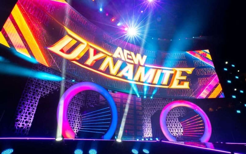
AEW decided to make some notable changes to the overall product this year, with a massive overhaul to Dynamite’s look and feel, especially its color scheme, logo, stage and more. The reason for all these presentation changes has now been revealed.
While speaking to AEW Unrestricted, Michael Mansury, who joined AEW in December 2022, shared insights into the new set and visual changes for AEW Dynamite. Mansury noted that when he first saw the new set in Seattle at the start of the year, he wasn’t entirely impressed with it. He described the initial set as reminiscent of the “Survivor Series” look, which didn’t resonate with him.
“I joined in December of ’22. I joined I believe Winter is Coming ’22 was my first show, so in Texas, right? I learned that in January when we were kicking off the year with Dynamite in Seattle, Washington that we were going to roll out a brand new Dynamite look, a brand new Dynamite set and I was like, alright, cool. That’s great. Something to look forward to. I can’t wait to see it. I didn’t really know what was going on. When we arrived in Seattle that day and I saw the set, it was cool, but it wasn’t my favorite thing, just speaking honestly here. I saw the new graphics, and I’m not gonna lie to you, and this has nothing to do with the fact that I spent the bulk of my career there, but I remember walking in that day when they were starting to run through elements and stuff I looked, and I was like, ‘Oh, that looks like Survivor Series, sort of look.’ At this point, I’m maybe three weeks into the job at AEW. I’ve been out of wrestling for a couple of years at this point doing MMA and working with Pat McAfee and his group in Indianapolis, but that was the first thing that hit me was man, that red and blue.”
After discussions with Tony Khan, the direction for the set and visuals was amended throughout 2023 to move away from the initial interpretation. The goal was to reflect the “throwback American Gladiators” look that Khan initially envisioned while avoiding any resemblance to other wrestling promotions’ aesthetics.
”I remember connecting with Tony at some point, a couple of weeks after that show, and he’s like, initially, the direction I had kind of given the folks was he wanted to look more like the throwback American Gladiators look. I think that was kind of the interpretation of what kind of fell into play. If you notice as we got later into 2023, we amended it a little bit to kind of get away totally from Raw and SmackDown and the Survivor Series look. We had known going into that summer that we were going to kind of refresh Dynamite going into 2024. Going into Dynamite 200 I believe it was, we went with a bit of a throwback look with the color powder burst or whatever, and I know that that was something that resonated very strongly with our fan base. Our fan base, they were very much into that sort of original vibe. It kind of fit into a lot of what we’ve been talking about internally when it came to sort of restoring the feeling.”
As AEW looked ahead to 2024 and the 200th episode of Dynamite, the focus shifted towards evolving the show’s visual identity. Mansury and the AEW team aimed to strike a balance between paying homage to the promotion’s beginnings and showcasing AEW’s continued growth and evolution. This approach involved incorporating vibrant and eye-catching elements that acknowledged AEW’s roots while also presenting a fresh, modern take on the show’s visual presentation.
”I started to have preliminary conversations with Tony in terms of the new look for next year and also we began talking about the set. That theme was there, that restoring the feeling, but me personally, I didn’t want to do a full reversion back to what was. For me, I was of the mindset of let’s pay homage to day one, but let’s also show that AEW is continuing to grow, continuing to evolve. So when I got together with our internal team, both on the inner arena and the post production side, and then we also involved the team from WBD as they’re phenomenal collaborators to work with, you know, case in point are those what we’re calling the ready to fight from those that have been airing across the WBD networks that have just been so awesome and a fresh coat of paint and a different way to kind of attack promotion for a wrestling organization.”
”We wanted to kind of tip our cap and acknowledge what brought AEW to the dance, but also show you like, hey, we’re also thinking about growth and moving towards the future. So that was the idea behind it. That’s why even with that colorful presentation and vibe of the new Dynamite package, it’s a throwback to the color splash in terms of just that vibrance and that eye-catching, eye grabbing sort of color palette, but it’s an evolution of it. It’s not a direct, just sort of quote unquote rip off of it. It’s just more like, hey, we acknowledge you.”
Overall, the changes reflect AEW’s commitment to evolving its brand and visual identity while respecting the core aspects that made the promotion successful in the first place.
Are you a huge fan of AEW Dynamite’s current look and feel? Let us know in the comments section below!
April 12, 2024 10:50 am
Disqus Comments Loading...
Exclusives
